About Giang
I’m a product designer with a background in Visual Communication from Arizona State University. I started in branding and marketing, shaped by Swiss design principles, and now focus on building clear, scalable product experiences. I’ve led design across fintech, health, education, real estate, and supply chain, simplifying complex systems into intuitive tools that teams rely on and users actually enjoy.
I’m known for moving fast without losing craft. I use AI to quickly bring ideas to life, getting strong prototypes in front of stakeholders early to drive alignment and momentum. I’m comfortable in ambiguity and focused on outcomes:
Design that is simple, beautiful, and usable.
Skillsets
Product Thinking
Claude Code
Design Systems
React/Tailwind
Cursor
UX Strategy
Rapid Design-to-Code Prototyping
AI-Assisted Design & Development
Scalable UI Architecture
01 Fintech
I’ve spent several years working with American Express Global Risk Technology, designing systems that support both internal teams and customer-facing experiences.
Across this work, I’ve led and contributed to 20+ applications, helping teams manage risk, improve decision-making, and streamline complex financial operations.
What I’ve done:
- Designed and shipped internal tools and customer-facing products
- Helped define and build a rules engine for risk and decisioning systems
- Partnered closely with business stakeholders to align on strategy and outcomes
- Worked alongside engineering teams to bring products from concept to production
- Simplified complex financial workflows into clear, usable systems
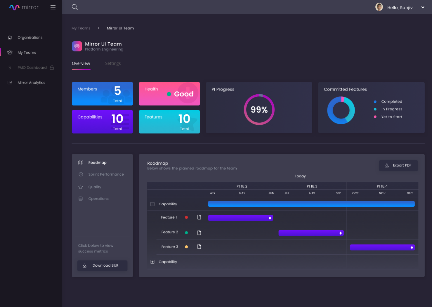
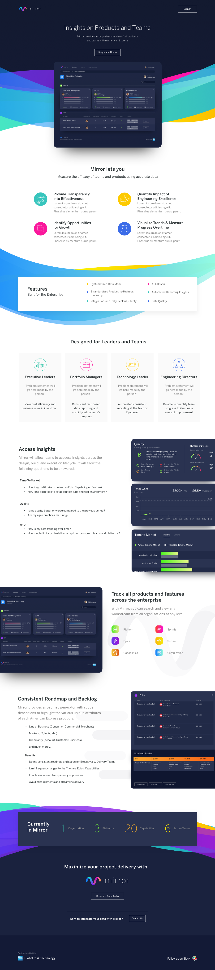
Platform for Product Delivery
& Roadmap Alignment
Overview
Designed an enterprise platform to help teams measure and improve delivery across timelines, quality, and cost. The goal was to create a system that brings visibility into execution, enabling teams and leadership to make more informed decisions at scale.
Role: Product Design Lead
Scope
- End-to-end design of a complex product platform
- Internal tools and external marketing site (landing experience)
- Product identity, visual system, and brand direction
- Design QA and collaboration through implementation
Impact & Outcomes
- Secured buy-in from executive leadership (VP level)
- Successfully introduced the platform to multiple pilot teams
- Established a foundation for organization-wide rollout
AMEX GRT Product Ecosystem
Overview
At American Express Global Risk Technology, I worked across a suite of interconnected products designed to support risk, data, and operational workflows at scale.
Rather than treating each tool in isolation, the goal was to create a cohesive system of products, each with its own purpose, but unified through a shared design language and experience.
Role: Product Design Lead
Scope
- Designed 10+ products across the ecosystem
- Defined product identities and visual systems for each platform
- Ensured consistency through a shared design foundation
- Collaborated with stakeholders and engineering to bring products to production
Impact & Outcomes
A unified ecosystem of tools that:
- Scales across teams and use cases
- Improves clarity in complex systems
- Enables more consistent and efficient product experiences


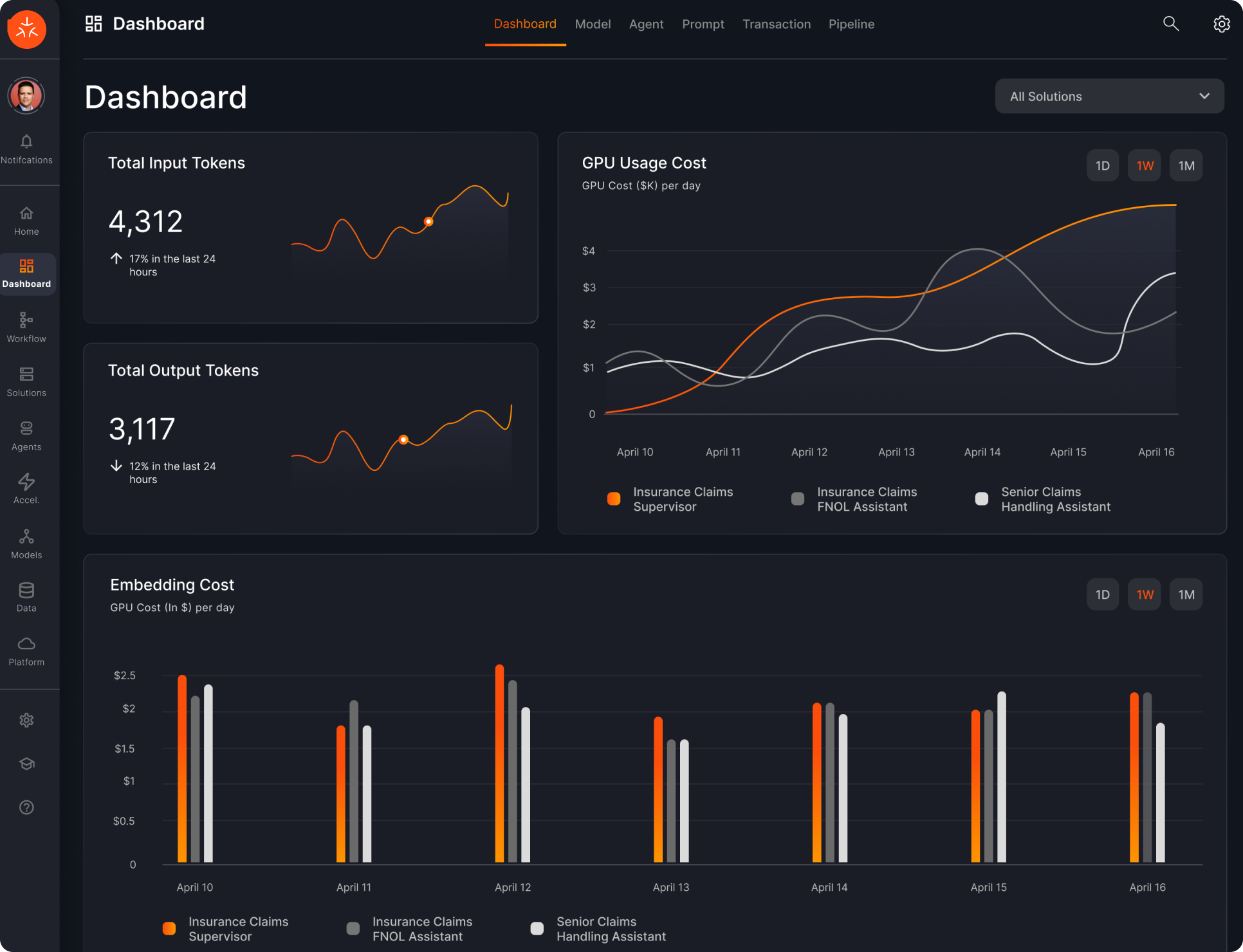
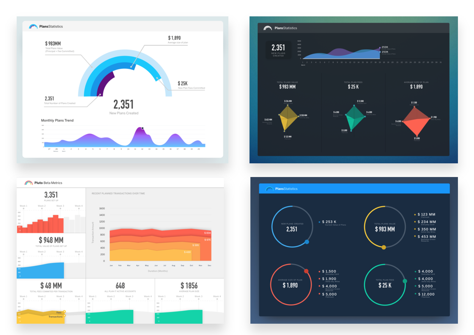
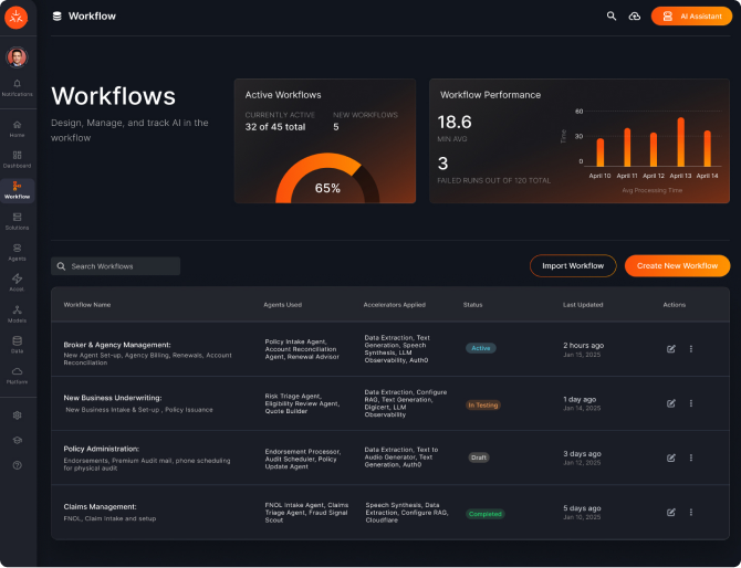
Various Monitoring Dashboards
Overview
Built for leadership, these dashboards give VPs a real-time snapshot of product performance across the organization, making it easy to track progress, identify risks, and make decisions with confidence.
Additional Fintech Experience


02 AI Systems
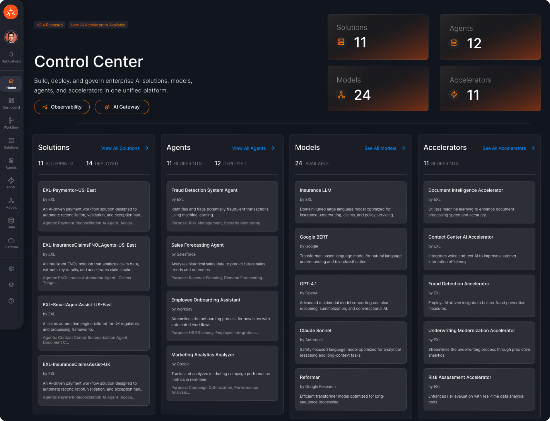
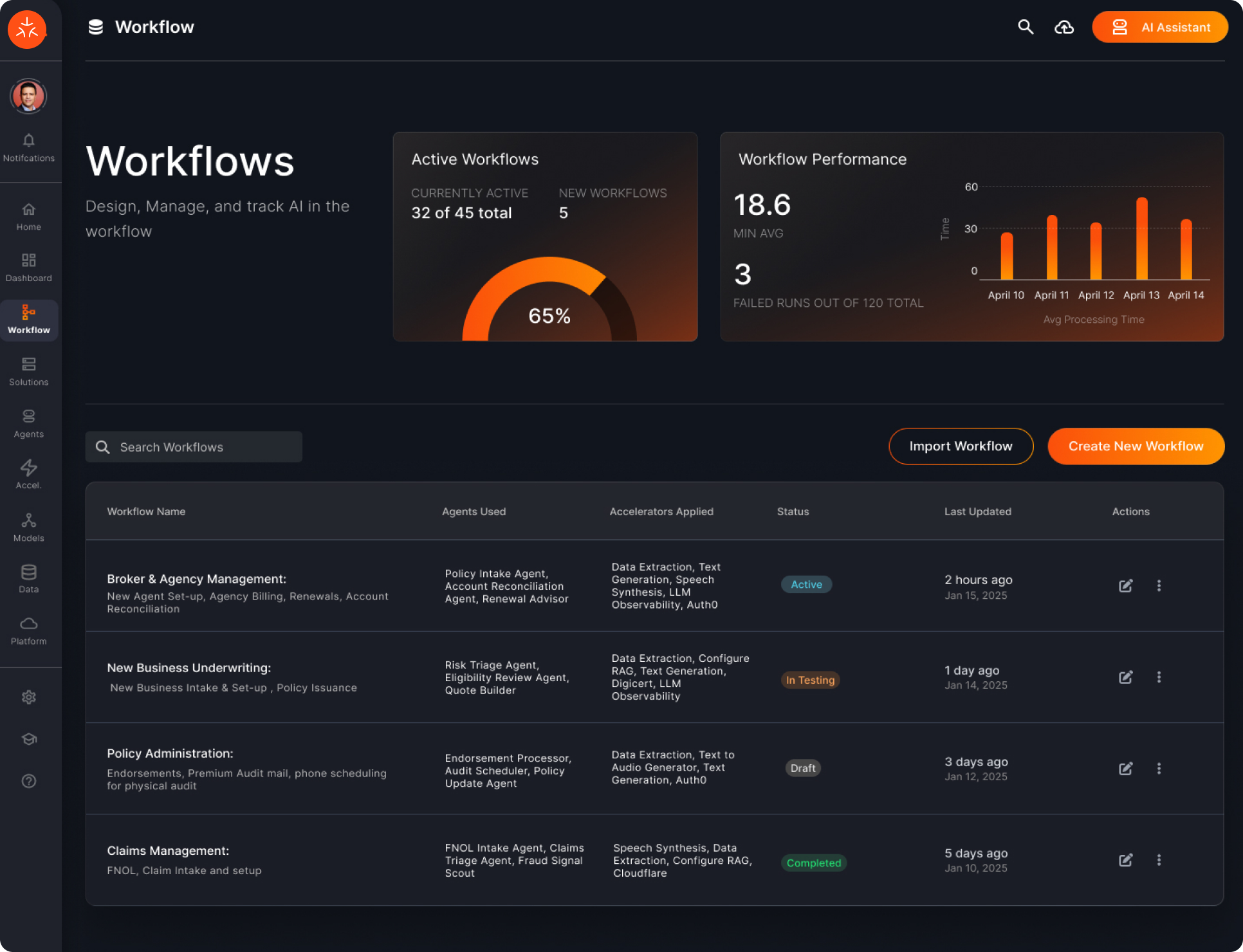
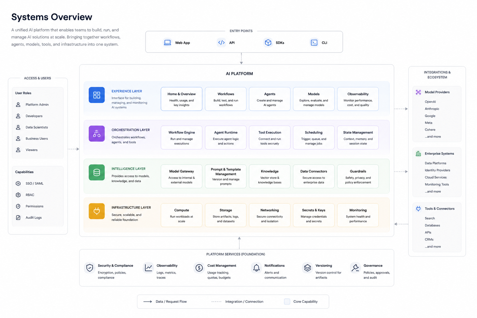
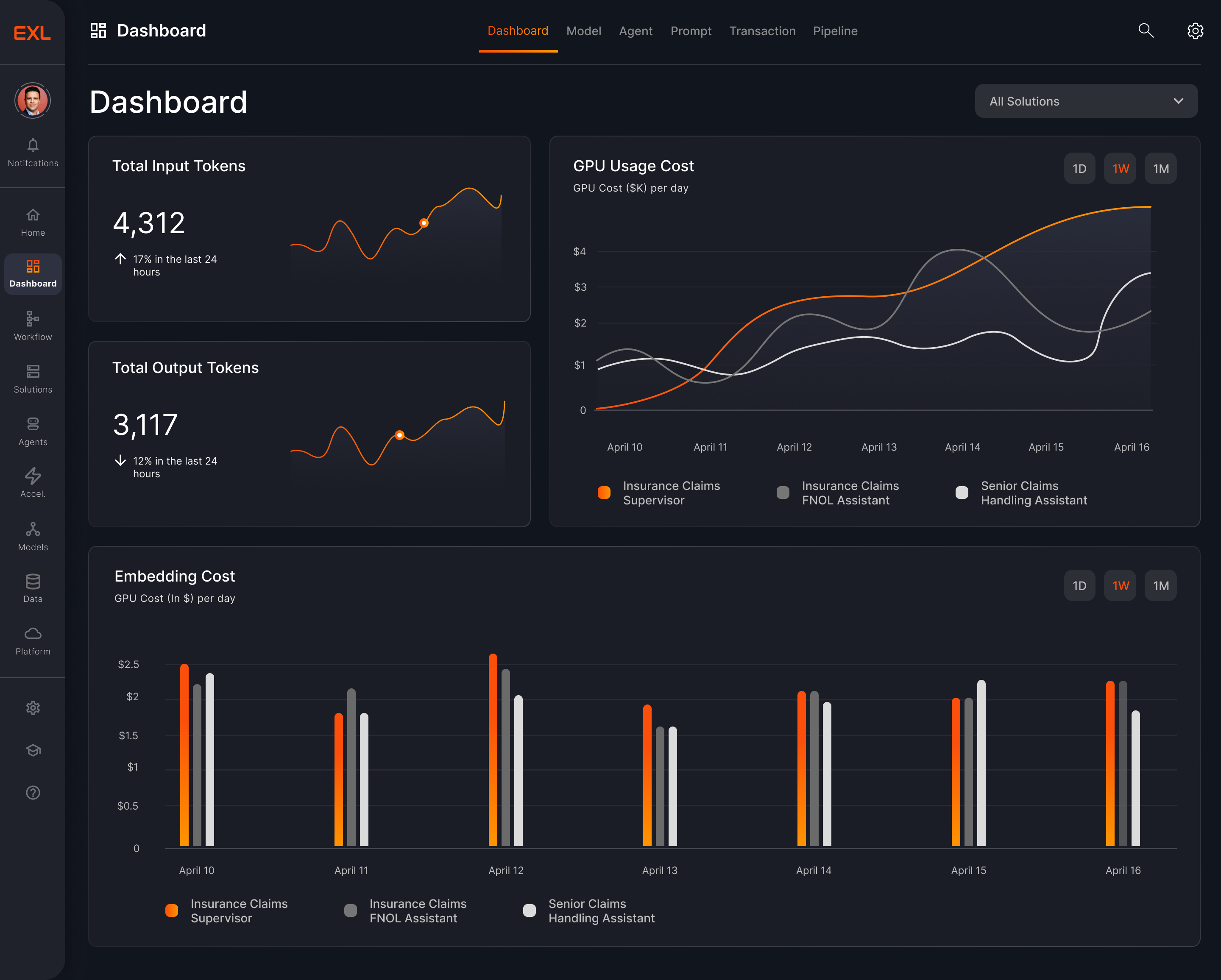
At my current position, I lead the design of a unified AI platform that brings together workflows, agents, models, and infrastructure into one system. The goal is to simplify how teams build, deploy, and monitor AI solutions at scale, while establishing a consistent design language across complex, technical surfaces.
The challenge is balancing complexity with clarity, making advanced concepts like agents, pipelines, and observability feel intuitive. I focus on clear information hierarchy, reusable patterns, and a scalable design system, enabling teams to move faster with greater visibility and control.
What I’ve done:
- Led design of a unified AI platform, centralizing workflows, agents, models, and infrastructure
- Consolidated fragmented tools into a cohesive system, improving clarity and operational efficiency
- Established a scalable design system and language to accelerate speed to market
- Defined the experience for complex AI workflows, translating technical systems into intuitive, usable products
Core Product Experience
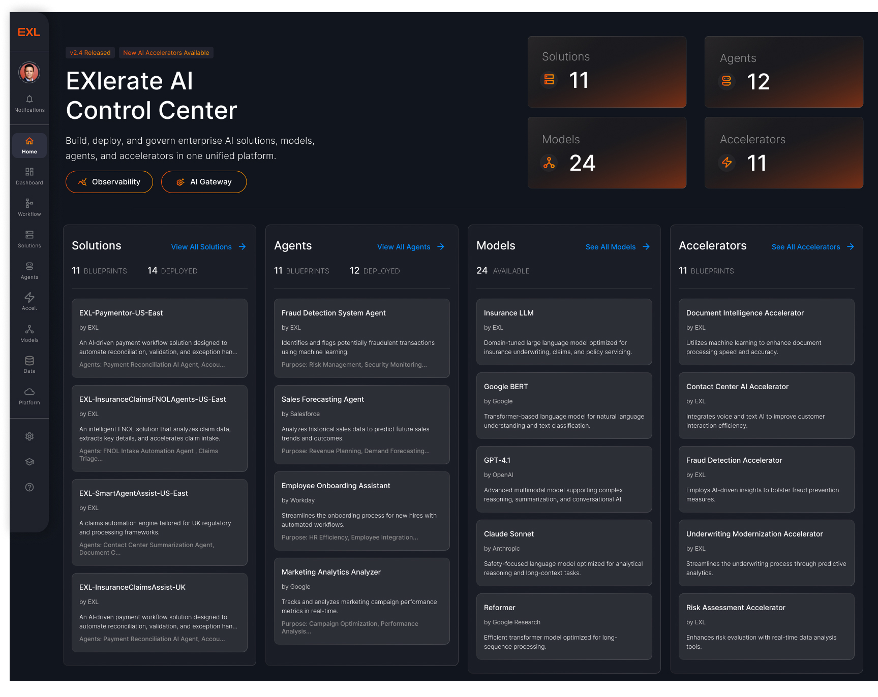


Role: Product Design Lead
Impact & Outcomes
- Unified fragmented AI tools into a single platform across teams
- Improved visibility into system performance, usage, and cost
- Accelerated time to build and deploy AI workflows
- Enabled both technical and non-technical users to operate complex systems
- Established a foundation for scalable AI product development
03 Design
Systems & Scale
I design scalable design systems that unify products and accelerate how teams build. Across complex enterprise platforms, I establish consistent patterns, reusable components, and a shared design language that brings clarity to fragmented experiences.
The focus is on creating systems that balance flexibility with structure while supporting multiple products, teams, and use cases while maintaining consistency.
By standardizing interaction patterns and visual foundations, I help reduce design debt and enable faster, more reliable product development.
What I’ve done:
- Built and scaled design systems across multiple products and teams
- Defined a cohesive design language for complex, enterprise platforms
- Created reusable components and patterns to improve consistency
- Reduced design and development overhead through standardization
- Enabled faster delivery and scalability across product ecosystems

v2.4 Released
New AI Components Available
Build Intelligent AI Experiences
A modern design system built to power next-
generation AI interfaces. EXLerate unifies design and
development with intelligent components, adaptive
layouts, and futuristic visual language.
Get Started


View on Github
200+
Components
45+
Templates
10k+
Downloads
9:41

EXLerate AI
Online


Hello! I'm your EXLerate AI assistant. I can help you
with design system guidelines, component usage, and
best practices. What would you like to know?
2:34 PM
What's the recommended spacing for cards?
2:35 PM

For cards, we recommend using consistent padding
and gap values:
padding: 1.5rem;
gap: 1rem;
2:35 PM

Copy

Ask me anything...

Suggested:
Colors
Typography
System Status

AI Suggestion
Core Capabilities
Everything you need to build sophisticated AI-powered applications with speed and precision.

Modular Architecture
Composable components that fit together
perfectly. Build complex interfaces from atomic elements.
Explore Components


Performance First
Optimized for speed with minimal runtime overhead. Smooth 60fps animations and transitions.
View Benchmarks

Accessibility Built-in
WCAG 2.1 AA compliant out of the box. Keyboard navigation and screen reader support included.
Read Guidelines
Foundation
A Unified Design Language
From typography to color palettes, EXLerate provides a comprehensive set of design tokens that ensure consistency across all your AI products.

Adaptive Color System
Semantic color tokens that adapt to dark and light modes automatically.

Fluid Typography
Type scales that scale gracefully across different viewport sizes.

Iconography Set
Over 1,000 pixel-perfect icons optimized for digital
interfaces.
Explore Foundation
Color System

Primary
Orange / #FB4E0B
Grays
Neutral / #8C8C8C
Support
Status Colors
Typography

Heading 1
Aa
Heading 4
The quick brown fox
Paragraph
The quick brown fox jumps over the lazy dog.
Smart design systems scale.
Inter
Component Library
Pre-built components for rapid development.
View All Components


Ready to EXLerate your workflow?
Join thousands of designers and developers building the future of AI interfaces today.

I am a Designer
Access design tokens, Figma libraries, component specs, and visual guidelines to create pixel-perfect interfaces.

Complete Figma Design Kit

Design Tokens & Variables

UI Component Library

Visual Style Guidelines
Get Design Resources

Performance First
Coming Soon
Get production-ready code, component APIs, integration guides, and technical documentation for implementation.

React, Vue & Angular Support

NPM Package & CDN

API Documentation

Code Examples & Starters
View Documentation
Seamless Integration With

React

Vue

Angular

Figma

Sketch

EXLerate
The premier design system for AI-driven applications.Empowering teams to build better, faster, and smarter.
Resources
Documentation
Components
Icons
Figma Kit
Guidelines
Share Feedback
Help us improve EXLerate. Share your thoughts and suggestions.
Please share your feedback

Send Feedback
© 2026 EXLerate Design System. All rights reserved.
Privacy Policy
Terms of Service


Core Principles
Design Principles That Drive
Excellence
Our design principles are the foundation of EXLerate's user experience. They guide every decision we make, ensuring consistency, clarity, and innovation across all touchpoints.
Explore Principle


Download Guidelines

8
Core Principles

User First
Design Philosophy

Accessible
WCAG 2.2 AA

Performant
WCAG 2.2 AA
Principle 01
Clarity Above All
Every element serves a purpose. We eliminate ambiguity through clear visual hierarchy, intuitive navigation, and straightforward communication. Users should never have to guess what happens next.

Use clear, concise language that speaks directly to users

Establish strong visual hierarchy with typography and spacing

Provide immediate feedback for all user actions

Remove unnecessary complexity and cognitive load
View Example
Clear Action

Primary actions are visually prominent with clear labels and expected outcomes.
Continue to Dashboard
Unclear Action

Vague labels and hidden context create confusion and hesitation.
Next


Total Deployments
Last 7 days
128


Success Rate
+2.4% from last week
96.8%
MTTR
Mean time to restore
18.5m


Incidents
From deployments (7d)
2
Principle 02
Consistency Breeds Trust
Predictable patterns reduce cognitive load and build user confidence. When interactions behave the same way across the platform, users can focus on their goals rather than learning new patterns.

Maintain consistent component behavior across all contexts

Establish strong visual hierarchy with typography and spacing

Provide immediate feedback for all user actions

Remove unnecessary complexity and cognitive load
View Pattern Library

Principle 03
Design for Everyone
Accessibility isn't an afterthought—it's fundamental to great design. We
create experiences that work for users of all abilities, ensuring everyone can accomplish their goals effectively.

Meet WCAG 2.1 AA standards for contrast and readability

Ensure full keyboard navigation and screen reader support
Provide alternative text and descriptive labels
Design for diverse cognitive and physical abilities
Accessibility Guidelines

4.5:1
Contrast Ratio
Aa
Aa

Full Navigation
Keyboard Support
Tab
Enter
Space
Esc
Load Time
Optimal
Initial Load
1.2s
Interaction
Fast
Response Time
<100ms
Principle 04
Speed Matters
Performance is a feature. Fast, responsive interfaces keep users
engaged and productive. We optimize every interaction to feel
instantaneous and fluid.

Optimize assets and minimize bundle sizes

Implement progressive loading and lazy loading strategies

Provide immediate feedback for all user actions

Use skeleton screens and loading states effectively
Performance Standards
Additional Core Principles
Four more principles that complete our design philosophy
Principle 05

Intelligent Defaults
Anticipate user needs with smart defaults that reduce friction and speed up workflows.
Pre-fill forms with contextual data
Suggest relevant actions based on usage
Remember user preferences across sessions
Principle 06

Trustworthy & Secure
Build confidence through transparent data handling and security-first
design practices.
Communicate security measures clearly
Provide visibility into data usage
Design secure authentication flows
Principle 05

Scalable Architecture
Design systems that grow with user needs without compromising
simplicity or performance.

Build modular, reusable components

Plan for feature expansion and complexity
Maintain consistency as the system evolves
Principle 06

Delightful Details
Thoughtful micro-interactions and polish that make everyday tasks
enjoyable.

Add meaningful animations and transitions

Celebrate user achievements and milestones
Create moments of unexpected delight
Putting Principles into Practice
Practical guidance for applying our design principles in your daily work

For Designers
Reference these principles during design reviews and when making component decisions.
Design Checklist

For Developers
Coming Soon
Ensure implementations align with principles
through code reviews and testing.
View Documentation

For Product Teams
Coming Soon
Use principles to evaluate features and prioritize user experience improvements.
View Team Guide
Ready to Build with Purpose?
Explore our component library and guidelines to see these principles in action.
Browse Components

Read Guidelines

EXLerate
The premier design system for AI-driven applications.Empowering teams to build better, faster, and smarter.
Resources
Documentation
Components
Icons
Figma Kit
Guidelines
Share Feedback
Help us improve EXLerate. Share your thoughts and suggestions.
Please share your feedback
Send Feedback
© 2026 EXLerate Design System. All rights reserved.
Privacy Policy
Terms of Service


Component Library
Build Faster with
Pre-built Components
A comprehensive collection of production-ready UI components
designed for AI-powered applications. Each component is accessible,
customizable, and optimized for performance.
Get Started
View on Github
200+
Components
45+
Templates
10k+
Downloads
Component Preview

15 Components

8 Color Tokens

100% Accessible
Button
Active
Primary
Secondary

Input Field
Search...


Data Table
Name
John Doe
Status
Active
Role
Admin

Alert
Connection error
detected. Please try
again.
All Components
Forms
Navigation
Data Display
Feedback
Overlays
Buttons
Primary, secondary, and icon button variants with different sizes and states.

Code

Figma

Standard

Small

Extra Small

Large
Large

Disabled
Disabled
Standard
Small
Extra Small
Primary Buttons
Secondary Buttons

Standard

Small

Extra Small

Large
Disabled
Standard
Small
Extra Small
Large
Disabled
Linked Buttons
Extra Small
Small
Standard
Disabled
Large
Extra Small

Small
Standard
Disabled
Large
Icon Buttons


Input Fields
Text inputs, search fields, and form controls with validation states.

Code

Figma
Label Title
Enter info...
Label Title
Enter info...
Label Title
Enter info...
Label Title
Enter info...
Default
Label Title
Description of input
Enter info...
Label Title
Description of input
Enter info...
Label Title
Description of input
Enter info...
Label Title
Description of input
Enter info...
Default with
Description
Normal
Focused
Error
Disabled
Dropdowns & Selects
Selection dropdown, checkbox, radio, and switch components for forms and navigation.

Code

Figma
Select Item

Select Item
Item 1
Select Item
Dropdown
Check Box
Radio


Switch
Default
Default
Items
Disabled
Disabled + Selected
Selected

Data Tables
Structured data display with pagination.
Code

Figma
Column


1
00/00/0000
Lorem ipsum dolor sit amet consectetur adipiscing elit sed do eiusm
2
00/00/0000
Lorem ipsum dolor sit amet consectetur adipiscing elit sed do eiusm
Column
Column #
Date
Title
Title
Title
Actions
2
00/00/0000
Lorem ipsum dolor sit amet consectetur adipiscing elit sed do eiusm

1
2
3
4
5

Showing 1 of 10 of 320 users
Modals & Dialogs
Overlay components for focused user interactions and confirmations.

Code

Figma
Modal
Tooltip / Toast
Description
Title

Enter info....
Button

Button
Modal - Buttons + Fill In + Close
Modal - Buttons
Modal - Buttons + Close
Title
Lorem ipsum dolor sit amet, consectetur adipiscing elit, sed do eiusmod tempor incididunt ut.
Button
Button
Title

Button
Button
Lorem ipsum dolor sit amet, consectetur adipiscing elit, sed do eiusmod tempor incididunt ut.
Cards
Flexible card components for displaying grouped content and information.

Code

Figma
Standard
Buttons
Selection

Title
Lorem ipsum dolor sit amet, consectetur adipiscing elit, sed do eiusmod tempor incididunt ut.
EXL
Lorem ipsum dolor sit amet, consectetur adipiscing elit, sed.
Title
Primary Large
Secondary Small
Secondary Large
Lorem ipsum dolor sit amet
Title
Lorem ipsum dolor sit amet, consectetur adipiscing elit, sed do eiusmod tempor incididunt ut labore et dolore magna aliqua. Ut enim ad minim veniam
Title
Tabs
Organize content into separate views with tab navigation.

Code

Figma
All Services
Authentication
Data Processing
Integration
Chips / Tags
Labels, status indicators, and removable tags for categorization.

Code

Figma
Status Chips (Table)
Completed
Active
In Testing
Draft
Error
Roles / Labels Chips (Table)
Role/Label 1
Role/Label 2
Role/Label 3
Role/Label 4
Role/Label 5
Role/Label 6
Icon Chips (Table)

Success

Running

Failed
Labels Tags (Cards)
Primary
Secondary
Data Visualization
Reusable charts and data patterns designed for clarity, consistency, and quick interpretation.

Code

Figma
Primary Cards
Secondary Cards
Visualization Cards
Secondary Visualization Cards
Title
00
Title
Status
00

#%
Title
0000
Status
Number Basic
Number Detailed
Large - Number Detail


Title
Status
00

#%
Title
000
Large - Number + Visual
Large - Number + Visual

EXLerate
Design System
© 2024 EXLerate. All rights reserved.

Design Guidelines
EXLerate Design
Guidelines & Standards
Comprehensive design standards and guidelines for building consistent, accessible, and beautiful user experiences across the EXLerate platform.
Get Started
View on Github
8
Color Tokens
15
Typography Scales
4
Elevation Units
Color System
Our color palette is carefully crafted for dark UI environments with high contrast and accessbility.
Primary Colors
Orange 700 (EXL Main)
#FB4E0B
Orange 600
#FA6A32
Orange 400
#FA8E64
Orange 200
#FAC3AF
Gray Scale
Gray 700
#212121
Bar Chart
Gray 600
#616161
Bar Chart
Gray 550
#707070
Icon / Bar Chart
Gray 500
#FAC3AF
Secondary Text / Input labels
Gray 400
#BDBDBD
Secondary Text / Text Field Placeholder
Gray 300
#E0E0E0
Secondary Text / Bar Chart
Gray 100
#FCFCFC
Secondary Text / Bar Chart
Gray 000
#FFFFFFF
Primary Text
Gradients
Primary Gradient
#FB4F0B
#FF9500
Degree: -90

Primary Vertical
#FB4F0B
#FF9500
Degree: 0
Usage: Bar Chart
Secondary Gradient
#3ACD41
#A6F345
Degree: 0
Usage: Completed Step
Dark Gradient
CSS Tag
linear-gradient(114.073deg, rgba(66, 59, 55, 0.6) 3.4887%, rgba(66, 59, 55, 0) 34.701%),linear-gradient(138.583deg, rgba(59, 43, 30, 0.37) 43.561%, rgb(251, 78, 11) 112.68%);
Usage: Card Background
Linear
#616161
#616161
#BDBDBD
Degree: 37
Usage: Outline
Semantic Colors
Success
#27CB06
Error
#FF2C30
Link
#279EFF
Typography
Our type system uses Inter for UI elements and display headings.
Type Scale
Scale Category
Weight
Size
Line Hight
Letter Space
H1 Heading
Medium
43
Auto
0%
H2 Heading
Medium
34
Auto
0%
H3 Heading
Medium
27
Auto
0%
H4 Heading
Medium
22
Auto
0%
H5 Heading
Medium
18
Auto
0%
H5 Heading Regular
Regular
18
Auto
0%
Paragraph Medium
Medium
14
Auto
0%
Paragraph Regular
Regular
14
25.9
0%
Paragraph Light
Light
14
Auto
0%
Small Medium
Medium
12
Auto
0%
Small Regular
Regular
12
Auto
3%
Small Light
Light
12
18.3
0%
Extra Small Medium
Medium
9
Auto
0%
Extra Small Regular
Regular
9
Auto
0%
Extra Small Light
Light
9
Auto
0%
Elevation
Consistent elevation create visual hierarchy and depth.
Background Color
#11151D
Base Level 1
#1B1D26
Base Level 2
#2D2F37
Base Level 3
#46484F
Grids
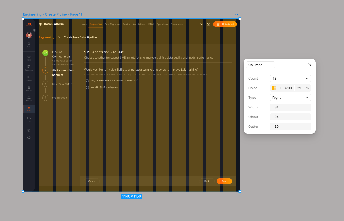
Our layout uses a 12-column grid system to ensure consistent spacing and alignment across the design. Below are the key specifications:

Column Count: 12
Gutter Width: 20px
Offset (Margin): 24px on each side
This grid provides a flexible and balanced structure for aligning content and maintaining visual rhythm across different screen sizes.
Border Styles
Our layout uses a 12-column grid system to ensure consistent spacing and alignment across the design. Below are the key specifications:
Customize Model
arrow-right
Border-General
Color: Linear
Stroke Weight: 1px
Radius: 10px
Text
An insurance domain-specific model for claims processing and underwriting.
EXL Insurance LLM
Customize Model
arrow-right
Customize Model
arrow-right
Border-Focused
Color: Primary Gradient
Stroke Weight: 2px
Radius: 10px
Icongraphy
Consistent icon usage and styling guidelines for visual communication.
Icon Library

Material Design Icons
Primary icon library for all UI elements
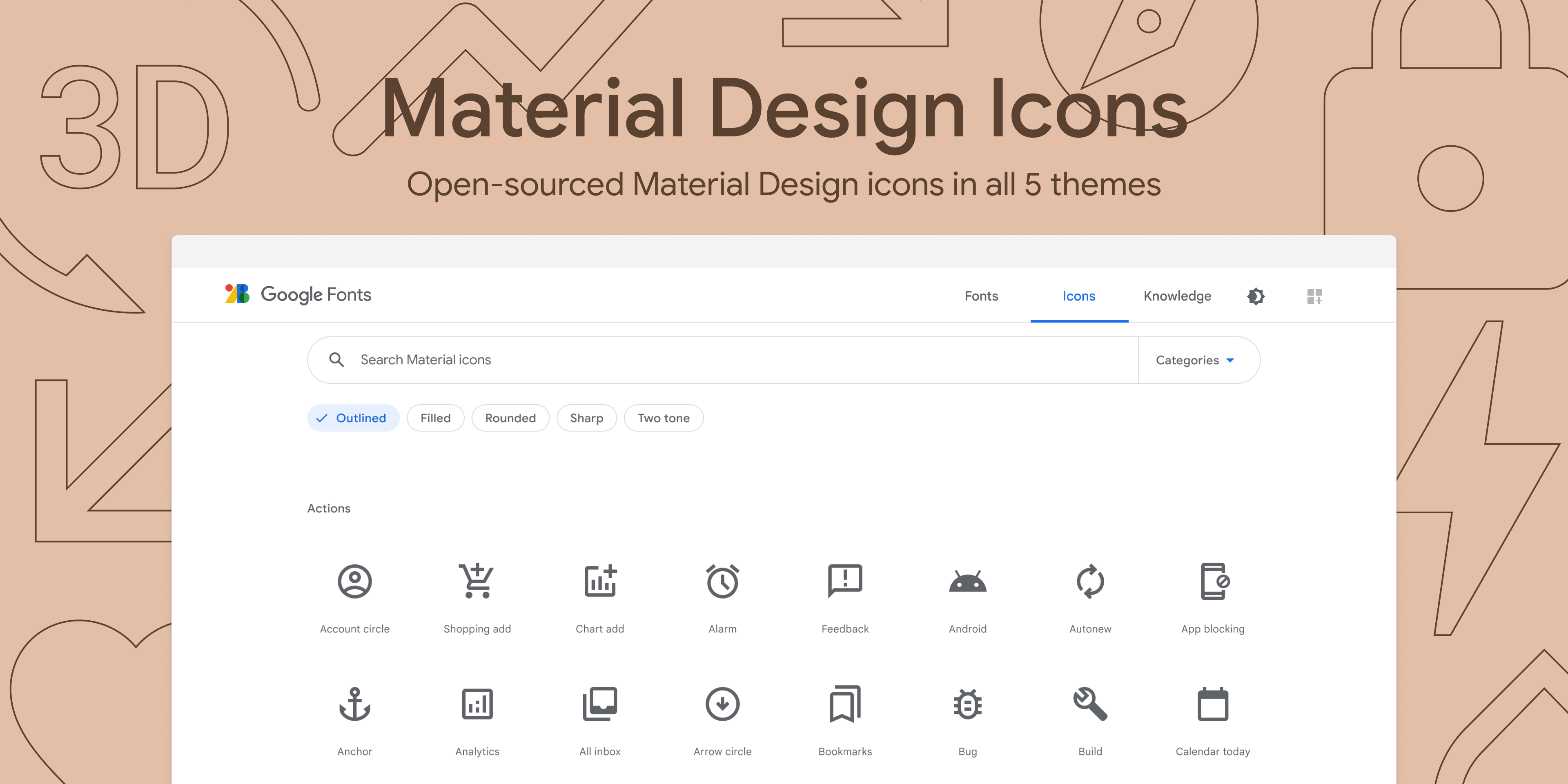
Get Material Symbols icons at fonts.google.com/icons. Recolor, resize, and copy and paste icons.
Material Design Icons Guideline: https://m3.material.io/styles/icons/applying-icons

EXLerate
The premier design system for AI-driven applications.Empowering teams to build better, faster, and smarter.
Resources
Documentation
Components
Icons
Figma Kit
Guidelines
Share Feedback
Help us improve EXLerate. Share your thoughts and suggestions.
Please share your feedback
Send Feedback
© 2026 EXLerate Design System. All rights reserved.
Privacy Policy
Terms of Service

Systems Capabilities
Tokenized Design System

Modular Component Library

Cross-Platform Consistency

Scalable Design Language

Pattern Standardization

Developer Handoff Alignment

Theme & Customization

Design-Engineering Integration

Standardized design foundations across multiple products, enabling faster delivery, improved consistency, and scalable growth.
04 Product
Development
Over the past year, I worked on a freelance engagement designing a community-driven platform for small business owners, bringing together education, resources, funding opportunities, and peer connections into a single, unified experience.
The goal was to simplify how entrepreneurs discover support, learn, and grow, while creating a clear and approachable product across multiple service areas.
The challenge was organizing diverse content, courses, grants, events, and community features into something intuitive and actionable. I focused on strong onboarding, clear information hierarchy, and guided pathways that help users quickly find value and stay engaged over time.
What I’ve done:
- Designed an end-to-end platform experience, from onboarding to ongoing engagement
- Structured key product areas including learning, grants, events, and community
- Simplified access to resources through clear navigation and dashboard design
- Established a scalable design system to support future growth
- Improved discoverability and engagement through guided user flows
This platform provides entrepreneurs with a centralized hub to learn, connect, and access opportunities, reducing friction and increasing engagement across the ecosystem.


Sign in
Your email
Password
••••••••••
Remember me
Lost password?
Log In
Download the mobile app

Download on the
AppStore

Download on the
Google Play

Terms of Service and Privacy Policy

Small Business is
Big Business.
Register Today
Join for free today!
#PhxBizConnect by HUUB, is a city-wide online community and resource center for small businesses brought together by the City of Phoenix. Packed with free on-demand business tips from local experts and a 24/7 booking portal to hire the experts on your own time, you will never feel stuck again.
Learn More →


Welcome, Marc Chung
to your Phoenix HUUB, Your key to all things entrepreneurship and small business in your city.
75%
Complete Profile
Complete your profile 4/5
Update your Profile
An updated profile helps other businesses/owners/advisors give better tips and ideas for your business!
Update Profile

Introduce Yourself
Your next opportunity may be right around the corner. Do a shameless plug (who you are, what you do and a little about your business). We encourage it!
Let’s go!
Find Grants
We’re always looking for ways to help small businesses. Check out available grants and get notified of upcoming funding opportunities.
Yes, please!

Getting Started
Browse Most Accessed Courses

3 Marketing Ideas to Implement Today
An updated profile helps other businesses/owners/advisors give better tips and ideas for your business!
1 Lesson
Free
3 Marketing Ideas to Implement Today
An updated profile helps other businesses/owners/advisors give better tips and ideas for your business!
1 Lesson
Free
3 Marketing Ideas to Implement Today
An updated profile helps other businesses/owners/advisors give better tips and ideas for your business!
1 Lesson
Free
3 Marketing Ideas to Implement Today
An updated profile helps other businesses/owners/advisors give better tips and ideas for your business!
1 Lesson
Free
About
Contact
FAQ
HUUB is an entrepreneur support platform, creating resilience for all business owners.
PRIVACY | TERMS | Phoenix Policy & Terms of Use | All Rights Reserved ©2023


My Dashboard
Community Board
Learning Library
Events
Grants
Apply for 1:1 Support
Team PHX
Community Resources
Groups
Members


Account Settings


Find an Advisor
Rebecca Lane

heart
Marketing
Sales
Product

Book Advisor
Rebecca Lane is a highly accomplished business strategy and marketing expert advisor with a wealth of experience in helping companies achieve their....
Joe Ray
heart
Book Advisor
Joe Ray is a design and logo expert. Joe can help elevate your brand and nail down your look and feel. Set up an appointment with Joe today!

Branding
Logo
Design
Kristen Hadley
heart
Book Advisor
Kristen is a highly experienced and skillful at website design, SEO and business strategy. Let her help your business with great guidance and tips.

Website Design
SEO
Business Strategy
Natalie Miller
heart
Book Advisor
Kristen is a highly experienced and skillful at website design, SEO and business strategy. Let her help your business with great guidance and tips.

Finance
Product
Business Strategy


July
2023

MO
TU
WE
TH
FR
SA
SU
1
2
3
4
5
6
7
8
9
10
11
12
13
14
15
16
17
18
19
20
21
22
23
24
25
26
27
28
29
30
12:30pm - 1:30 pm
Book Advisor
12:00pm - 1:00 pm
12:15pm - 1:15 pm

New Training Available
“ChatGPT for Small Businesses.”
Check it out.

An Event is coming up that
might interest you
”Marketing for Retail”

Kelley, your city host, has
posted an opportunity for you.
Check it out.

Role: Product Design LeadScope: End-to-end design, UX, UI, design systemTimeline: 5 months
Impact & Outcomes
5+
active cities, scaling support for local small businesses
1000+
users onboarded, with strong engagement across core features
Scale
Established a scalable foundation for multi-city expansion
QA
Continuously improving through QA, user feedback, and iterative releases
05 Explorations
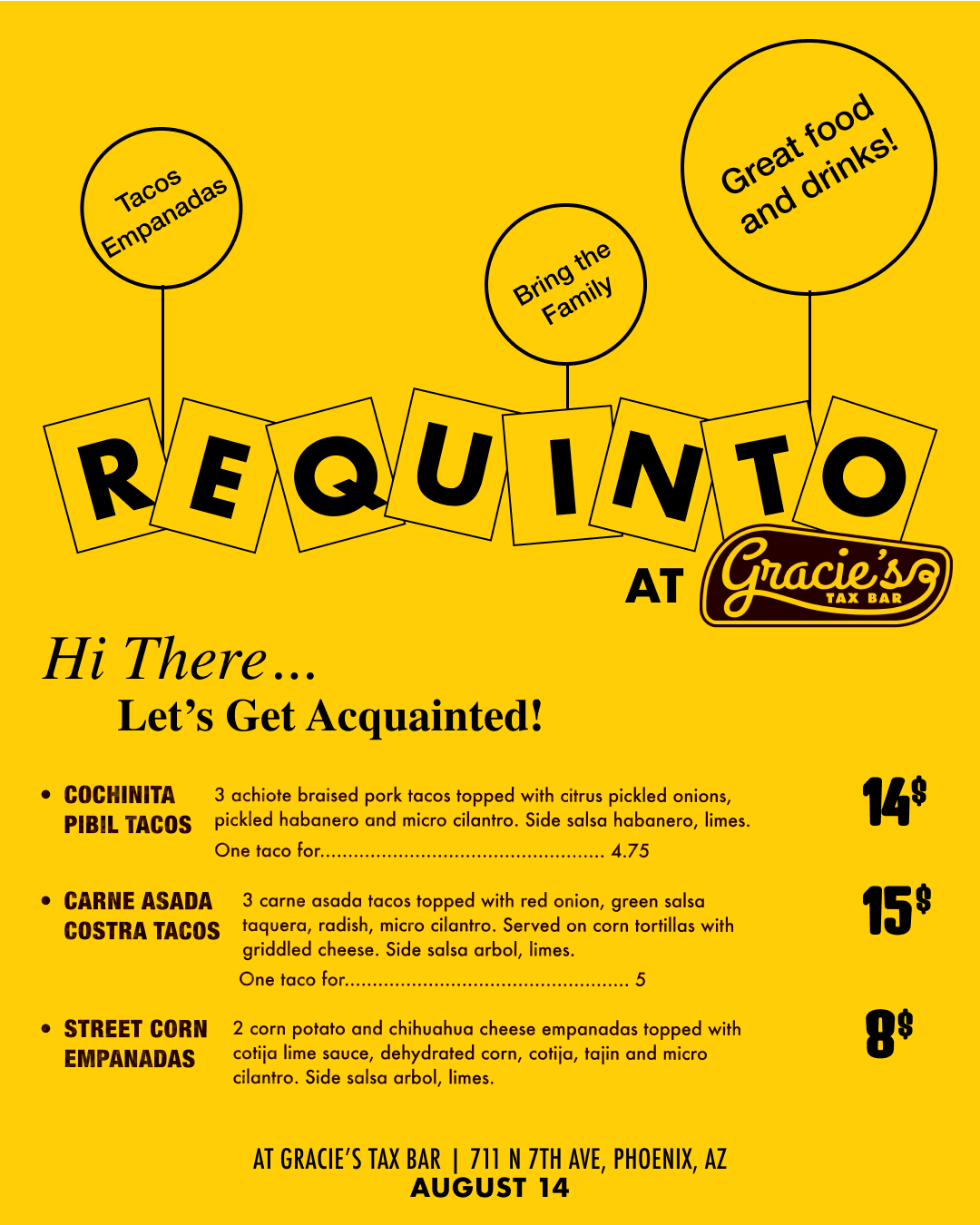
Outside of product work, I explore design through packaging, restaurant menus, and editorial pieces, often collaborating with friends and local businesses.
Requinto / Branding + Menu Design + Social Media Support
Requinto is a Phoenix-based pop-up run by my good friend and chef Erick Pineda, focused on Guerrero-style Mexican food. As the concept grew, I supported the team with design across key touch points including logo design and menu design. As the popularity of Erick’s pop-up grew, I continued to help support and shape a cohesive and recognizable visual identity.

Requinto Jaguar Logo
Various Menu Design

Industry


at

APRIL 24
2026
6pm to
Sell out
TLACOYOS (pre-Hispanic masa dish)
Chicken and Mole Tlacoyo
Red mole, chicken, radish, sesame seeds,
cilantro on a heirloom masa Tlacoyo.
13
Veggie Tlacoyo
Calabacitas, corn, onion, tomato, queso fresco,
cilantro on an heirloom masa Tlacoyo.
*Can be made vegan*
12
429 W Jackson St., Phoenix, Arizona 85003


Dessert

341 W Van Buren St Suite B, Phoenix, AZ
October 21 / 7pm
at QUARTZ
Cochinita Pibil Tacos
3 achiote braised pork tacos topped with citrus pickled onions, pickled habanero and micro cilantro. Side salsa habanero, lime. 15
Chile Ancho Tacos (V)
3 grilled chile anchos stuffed with refried beans and chihuahua cheese, Topped with pickled onions, salsa taquera and micro cilantro. Side salsa arbol, lime. 14
*Vegan option available
Tacos Gobernador
Griddled Shrimp tacos with chihuahua cheese, poblano, tomato and onion. Side Salsa arbol, pickled red onions, lime.
2 for 12, 3 for 17
Sopa de Fideo (Cup)
Fideo noodles in a chicken tomato broth. 5
Tacos
Sides

Enchiladas Suizas
3 chicken enchiladas covered in a creamy tomatillo sauce and melted chihuahua cheese. Topped with pickled red onion, micro cilantro. Side rice, chile torreado. 16.5
Vegetarian Enchiladas Suizas (V)
3 garlic potato enchiladas covered in a creamy tomatillo sauce and melted chihuahua cheese. Topped with pickled red onion, micro cilantro. Side rice, chile torreado. 14
Lox Tostada
House cured salmon, avocado mash, salsa macha, cherry tomatoes, red onion, pickled cactus and micro cilantro on an heirloom corn tostada. Side chile torreado, lime. 15
Avocado Tostada (V, VG, GF)
Avocado mash, pickled habaneros, radish, cherry tomatoes, red onion and micro cilantro on an heirloom corn tostada. Side lime. 7.5
PALETA
Strawberry, cucumber, mint and lime popsicle. 3.5
(Ask your bartender to put it in a cocktail!)


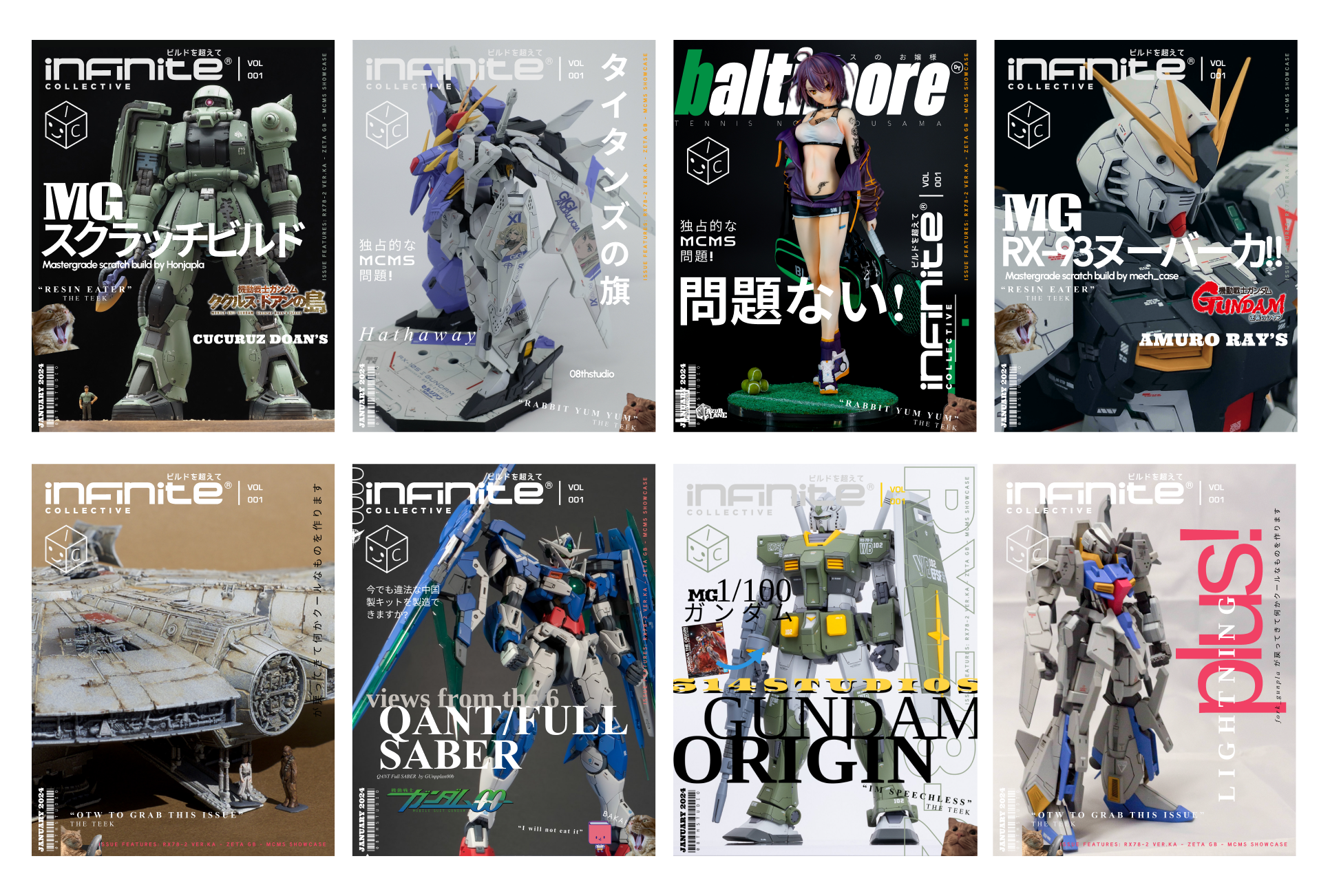
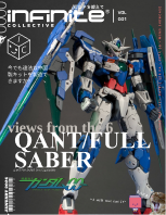
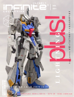
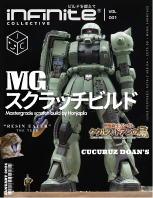
Magazine Covers / Editorial Design
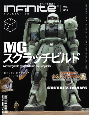
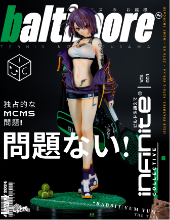
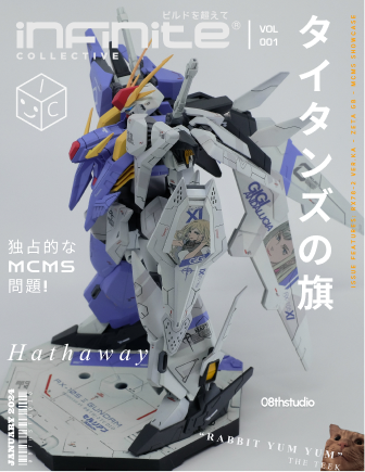
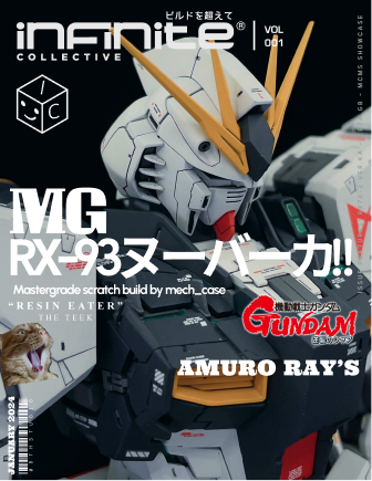
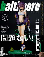
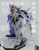
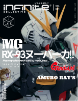
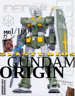
I create Japanese mook-inspired magazine covers for Gunpla and scale model builders, combining bold layouts, typography, and close-up visuals to present each piece like a collectible editorial feature.

Tết Vietnamese Lunar New Year / Envelope Design
This project is a set of lì xì (lucky money) envelopes for Tết, inspired by Vietnamese traditions I grew up around. It’s my first time designing for Lunar New Year, and a chance to reconnect with my roots, translating familiar symbols, food, and florals into a more modern, expressive visual style. This project is designed under a Vietnam-based agency called, BiYou Creative.